Barnflakes on Instagram
Like is such a weak word, almost an insult. To like a film, photo or painting is the blandest, most unimaginative platitude. Naturally, it pervades social media. The more likes you get, the more valued and popular you feel as a human being in (virtual) society.
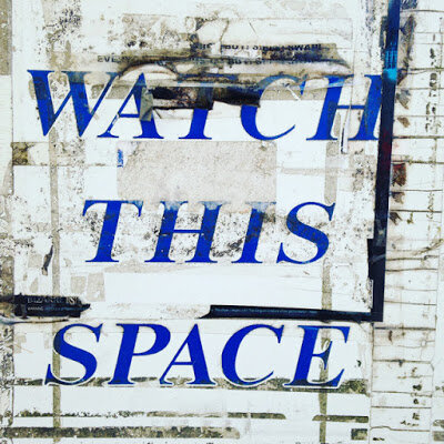
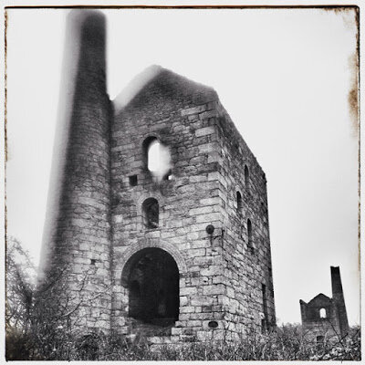
Instagram is 50% selfies of young women, 45% photos of meals and 5% arty pics. The medium is the message. There’s a formula to taking a great, arty photo on Instagram. Simply take a photo of anything with your phone – object, landscape, rusty sign. Apply a filter and an arty frame. Post it and you may well get hundreds of likes (though obvs I don’t – I’m all about anti-social media).
The web is full of so-called great photos. In particular travel photos. But are they great photos by great photographers? Well, probably not. Mainly, they’re photos of beautiful-looking places. The hard part is getting to the place – 99% of the photos is being in the location; 1% is the photo. I mean, literally a child or blind person could take most lovely travel photos – with a camera phone or a £10,000 Nikon DLSR – if they were at the stunning location. (It’s no surprise to me that a National Geographic photographer can take great images with an iPhone but apparently it’s headline news: here, here and here, for example.) Of course, some rules apply – composition, light etc, but, famously, a great photographer such as William Eggleston sometimes doesn’t even look through the viewfinder of his camera – he just points and shoots.
Compare most Instagram photos to a photo taken by a great photogapher. A great photographer can take a great photograph anywhere; though it helps being in the right time at the right place (as the recent viral photo of a Manchester street scene demonstrates). Travel photography is relatively easy because everything is ‘exotic’ and new; it’s much harder taking a good shot of a place you’ve always lived as it's hard to see it with new and different eyes.
Apple’s Shot on an iPhone 6 campaign seemed to show us anyone could take a great photo if they owned an iPhone 6 (and indeed, it is kind of true – with apps and filters anyone can make a boring photo at least look interesting). What Apple didn’t tell us was most of the photos were by professional photographers. The photos were predominately of a travel or 'exotic' nature, fitting in with Apple's supposed customer base as hip, moneyed and well-travelled individuals. (The hilarious spoof campaign, seen in San Francisco, is probably more on the mark for most users.)
I came across the website of one of the photographers used in the campaign. On his blog he charts his journey with the photo used by Apple, from taking the picture to the initial emails from Apple to finally seeing it on billboards across the globe. The finished photo is okay; the original, which he shows on his blog, looks very average – but after putting into Snapseed (also my app of choice), making it black and white and adjusting the contrast – hey presto, it becomes an Apple-ready image. I’m very happy for the guy but a lot of his photos look like holiday snaps, with an artistic bent.
Although photos have always been ‘doctored’, cropped and generally improved (before Photoshop was around) in the darkroom, in the past you at least needed a decent photo to begin with. Nowadays you can take any photo and with the help of a photo editing app, like Snapseed, you can add filters and adjustments to completely transform your dull picture into a masterpiece, then put it onto Instagram, get tons of likes and feel both popular and a great photographer.
Previously on Barnflakes
LinkedOut.com
Random Film Review: The Social Network
The Tedium is the Message

