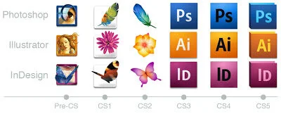
Minding your Ps, Ais & iDs
As Adobe Creative Suite gets more and more complicated with each upgrade, its icons get more simplified and dull. Back in the day Adobe Photoshop icons and credit pages used to be inspiring, beautiful images like beaches, feathers and eyes. Since Adobe CS3 however, along with the whole CS range, they’ve become rather corporate and uninspired. I much preferred their logos when they were illustrated icons rather than two letters in a box, reminding one of the periodic table symbols. An eye was a perfect icon for Photoshop and was kept for years. The new Ps logo is not only ugly and boring, but confusing, especially when you’ve got all the Creative Suite icons in a row on your dock (if you’re Mac; I have no idea what PCs look like nowadays). Ps presumably stands for Photoshop (though Photoshop is only one word; I guess it’s to remind us its native file format is .ps; though Ps makes me think of Postscript), yet Ai presumably stands for Adobe Illustrator – so shouldn’t Photoshop be AP (Adobe Photoshop)? For a package that prides itself on its consistency, this lack of it is confusing. Anyway, having to read the icons for the right package can take a second or two, so if you’ve got a whole row of Ps, Ai, ID, Dw, etc, especially when they're all the same size and weight, it’s counter-instinctive – you’ve got to read to decipher it. Before, with the illustrated icons, I’d instinctively go to the eye for Photoshop, Botticelli’s Birth of Venus for Illustrator and a butterfly (nicked from the CorelDraw icon) for InDesign. These are visual packages, so a visual identity for each package made sense.
Going from pre-CS icons to CS icons was tough, but I made it through, perhaps even grew to love the feather, flower and butterfly. Didn’t even mind too much when they changed colour and shape for CS2 (though initially it was confusing – they changed their colours!). But the icons from CS3 onwards, with their lack of imagination, corporateness, confusion and just plain monotony – for the premiere graphics and design packages, it’s just plain wrong.
Perhaps Adobe are trying to appeal to the Microsoft Office/Windows audience, those dull-minded people with their Excel charts and PowerPoint presentations. Maybe Adobe are trying to be more professional and serious. But even the icons for Microsoft Office have a ‘bubbly’ kind of feel to them (Microsoft trying to appeal to creatives?) with a similar letter-based system but also icons which quickly explain what each package is. The Adobe icons don’t look like they’ve been designed at all, so it comes as quite a surprise that Adobe actually have a Desktop Brand team. Their work must have been really cut out for them going from CS3 to CS4.
