Transworld Skateboarding Magazine Covers
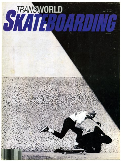
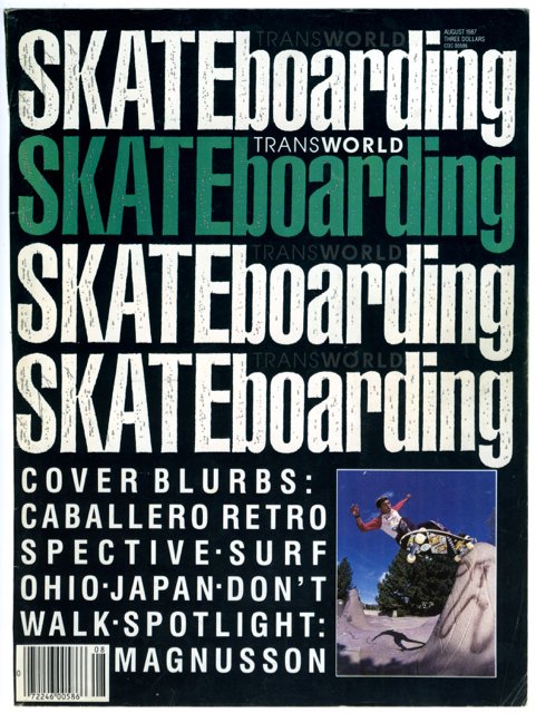
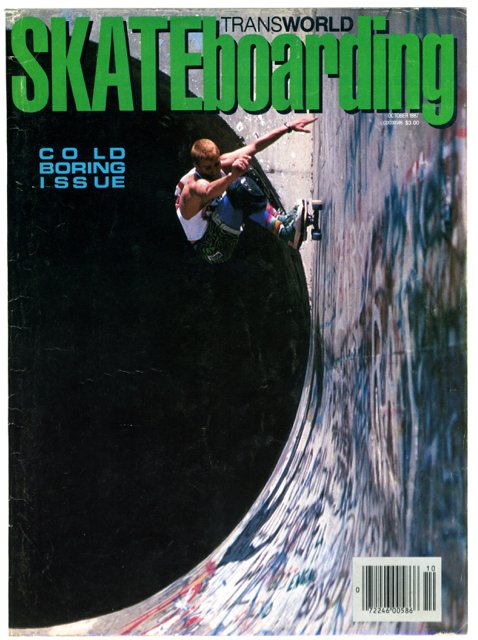
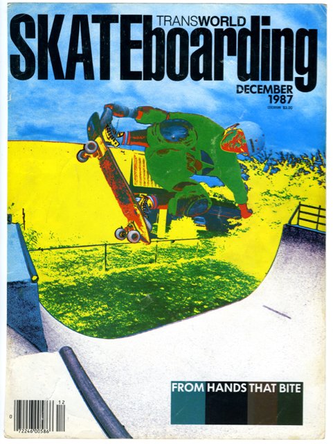
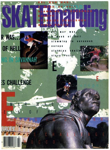
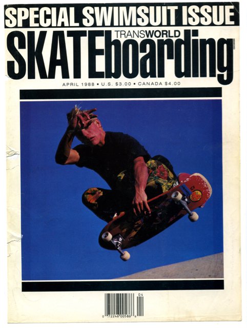
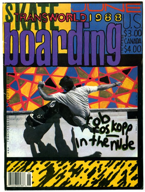
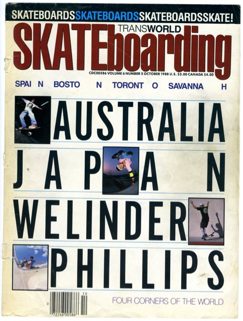
From left to right: June, August, October, December 1987, February, April, June, October 1988
I was a hopeless sk8er during both UK waves – first in the 1970s, then in the 1980s. But at least the 80s had the cool brands, graphics, boards and magazines. I used to buy Thrasher occasionally but Transworld Skateboarding was far more rad – and I had to go all the way to Slam City Skates, downstairs from Rough Trade in Notting Hill, to get a copy, which made it seem more elitist (you could buy Thrasher in your local WH Smith).
I never knew at the time that it was art-directed (from 1984-88) by the hugely influential graphic designer (and professional surfer) David Carson – but it was always the visuals that appealed to me: bold use of photography (some taken by Spike Jonze), experimental layouts and funky typography. Not quite as experimental as Ray Gun (1992-95), the magazine for which he is famous, but a nice primer, perhaps. Typical, maybe, of Carson’s unorthodox style, is the Bryan Ferry interview in Ray Gun. Carson found the interview boring and printed the whole thing in the typeface Dingbats – made up purely of ornamental icons, and hence unreadable. Now credited as the creator of grunge type, he has a lot to answer for.
His first graphic design book, The End of Print (1995), is the biggest selling graphic design book of all time (though, with only 200,000 copies sold, it’s not really saying that much).
Previous magazine covers
Flaneur; Sight and Sound; Time Out